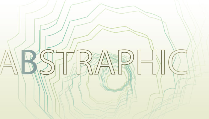
Abstraphic
Part 1: The Source
Discussing the concept of abstract thinking for design and how unseen forces can affect the resulting work. Part one in a series.
Introduction
Where does a good idea come from? I’ve sat in countless brainstorms on so many subjects I will often forget if I’ve thought about an idea in a previous session until half way through the process. Ideas can be a very fickle beast. This actually makes sense when you think about how little of our brains we actually use. I think of brainstorms to be us trying to push that percent a bit and in turn pulling it out and interpreting the raw sludge. There are countless books out their on how to brainstorm. Everyone has his or her own method. I have always moved to more relative ways to think up things. Never have I started with a blank piece of paper and said…”So what am I thinking?”. Too painful. I like to pick things out of source material and build on it – often by breaking it down.
Say we sat in a room together and I asked you to design a new kind of fruit in a new shape. Where does you head go? Likely to that what you already know. Possibly a round fruit to start. An apple maybe – because you are a designer and like their computer and you feel you need a clever start to your process. Or an orange – because you are reading this at the breakfast table and happen to be eating one. Did you know that we as humans are programmed to see round shapes and like them more than other shapes? I found this out while my wife was pregnant and our prenatal class nurse told the room that newborn babies like round shapes and are trained to seek them out at birth. The shape of a nipple. That bright red ball. How true it is I can’t say, but I admit it makes a lot of sense. How many of you thought square?
So you’re thinking about a fruit now. Take that fruit and instead of analyzing the colour or the shape try something more unique. Cut it in half. What shape is it now? If you were to transition from that shape to it’s whole shape in a sequence what would it look like? Transitions can be shown in static images in many ways from action lines to layered colours to blurs to time-lapsed frames. Would you use a grid or just lines? Are they vertical lines? Maybe they emanate out from it like sound waves. How does your fruit look now?
From here you can continue to cut out and break away elements and play with an abstracted form of your once perfect fruit – creating an entirely new structure. Or like some Abstract sculptors, try to focus on the negative space around this shape. What does it look like instead?
There is one issue with this last technic. What if you aren’t told what to think about? Like many of our challenges, class instructions or bosses we are usually directed to think about where that first step is. The past experiment was more about taking a preset step and extracting an alternate dimension. But what do we do when we aren’t so fortunate.
I am often told to open a book with logos to inspire me to make a logo. Bull shit. Sounds like the direction of someone who doesn’t know how to get to a destination but still wants it. “If I dream of the moon maybe I’ll just arrive”. If I wanted to copy a logo sure I can do that. But I don’t find other peoples work too helpful when I’m trying to find an original idea. Inspiration can come from much better and more genuine places than other people’s solutions. If you must look over them once you have moved past the initial stages of your work and are refining it to see how people may solved similar issues fine, but starting with an existing inspiration can lead to caging yourself in that directions endpoint. Instead like the shape of that fruit, force yourself to go beyond.
Inspiration via research and unseen forces
I remember watching a creative talk by design and direction guru Bradley Munkowitz (GMUNK) talk about how himself and a small team of very creative people developed over ten minutes of very abstract and beautifully organic design for the movie TRON Legacyat a Flash In The Can conference in Toronto. He would always show their inspiration and then their experiments and finally the work. I left that presentation so excited. The thing that really amazed me beyond the incredible work – was how candid he talked about inspiration and where it came from. Some came from visual design and information design – ways to show data (Always a great way to design for the sake of design), some more unique like scientific organic illustration from the early nineteenth century. And even from the original movie and how it’s inter linking line design worked. Inspirational.
And it brings an interesting point that I have always liked. Inspiration can come from anywhere. And takes a lot of different forms. I have an old, ugly, completely useless hand-carved wooden spoon. I keep it to remind me to look in nontraditional places for inspiration and creative thinking. It also has a matching wooden fork, which is in the hands of a friend of mine. Together this fork and spoon have a story to tell and act as proof that inspiration can help you in the real world. On a sunny day in Toronto around 2008 four creative people were challenged to think of a creative way to redesign a high profile client’s website and take it beyond a standard digital product catalogue. After sitting in boardrooms and limping along some very unsuccessful brainstorm sessions we packed up and spent the afternoon walking the retail heavy Queen Street strip. Popping in and out of stores, talking to store owners and staff about retail, trying to remind us what it meant to be a customer.
We ended up standing around in the basement of a yarn store feeling a little awkward – as we knew nothing of knitting (a group of mid to late 20s men). Four digital ad guys surrounded by material, yarn and sewing tools while a pair of sweet but obviously suspicious older women tried desperately to interact with us. It was in that moment that I saw them. Half a dozen wooden, 8 inch long, hand carved forks and spoons sitting in a tin seeming so out of place. I was curious and asked why there were there. It turns out these spoons were all that had survived a trip back from Africa by the stores owners. Whether it was a true story – or the sweet old lady was actually the worlds greatest sales woman in disguise we’ll never know. Yet I didn’t care. I bought them on the spot. It was that story that led us to the idea that every product from a client that prized unique designed items also has a story to tell. This simple idea helped us form an entire concept, strategy and design.
We creative professionals have a very bad habit when it comes to brainstorming. We like to think we know it all and it’s all locked in our heads – just waiting to be unlocked. Our pride makes us bang our heads and not ask for help trying to get it out. It may be stuck up there, bouncing around like chaotic lightening. However sitting in an office room staring at blank walls may just be the most un-inspirational place you could possibly attempt such a thing. This is part of the reason I don’t own hands on design books. Why any design annual I receive or pick up to see what others did lately is quickly thrown out and forgotten. I am always curious about the things people do to solve their problems but I don’t want them to guide my creative process. I look for other ways to find the source of an idea as far away from the obvious as possible.
Extract from the source not the reproduction.
Talk to an abstract artist. They are able to take an idea and pull out its essence to create their vision. Whether they are playing with negative space and shapes, or thinking about colour and emotion and how to visualize the invisible. They start at a single point and extract their ideas from them step by step until it often no longer seems related at all. Why can’t we as designers do the same thing? Sure you can use legible type so people understand the point and communicate with you. But that does not restrict you from framing that type in design that is more abstract. Something that seemingly feels connected but still manages to contrast its source. It all leads to continuity in design. Like a fashion designer using the models figure and a focused line to form shape and flow. You or your viewer may not even be able to understand it but it feels and looks correct. That emotional link is stronger than designing a colour because it matches another colour and stopping at that. Or simply because the brand bible told you it was the only colour to use.
Why is this way of thinking in alternative patterns so important? Because there is so much garbage out in a world made by and for visual beings. How many annual reports for corporate loggers or environmentalists do we really need to see using a wood grain texture with burned out type? (Thanks Photoshop and your inner bevel…I knew you would come in handy….) If you take nothing from reading all this, it’s that you should fight to design more than what is easy. Take that wood grain as an example. Ok, so we have wood. The first thing I think of is tree. So let’s be a logger and cut that tree in half. What do we have? The rings. Natural design. That will take you visually away from bark or vertical wood grain. Now instead of that awful brown – how about greens from the leaves or blue for the water that has helped grow those rings (and possibly the years that logger has been in business). Now if you look at trees and how their leaves grow it is a lot of sprouting. They start at a central point and break out, like veins. Think of where you could take your typography from that as your inspiration? I’m no longer seeing a wood grain cover with burned in type that looks like it came from the seventies. And the best part about abstracting your inspiration is you have a story to tell. One that helps your clients understand that infamous “Why blue” question. Here’s a hint – it’s not because you like the colour blue. And if it is – good luck convincing me you can do anything other than follow prescriptive direction.
That is why I say go to the source for inspiration – not to the representation. Try as we might what has already been done is the bastard child of a good original source. So why would you use it to guide you – or more importantly to manipulate you. My muses are often very unrelated. I’m a painter. I am a self confessed Disney addict so I watch old Disney movies, theme park videos and seek out memorabilia. I could blame that on my children and say it’s for them but that would be a lie. I collect odd toys and nick knacks – like a bobble head Star Trek Scotty, LEGO, Chinese musical balls and tourist trap junk. My book collection is filled with random fiction. I don’t own a single book about design process though I have a few books of artists and designers I have always liked (Sagmeister and the like). And yes – I do see the irony in writing something about process. From all of this I find inspiration.
Now that you are going out and finding real source material – find a way to keep it. Save it for the future. What if you forget the point and need to refocus? What if the idea dies and five years later you wished really badly that you could remember that one thing that one time – in that place with that person…argh! Stupid brain and your insistence on storing useless 80s movie and music trivia. Whether you take a photo, make scan, draw it or write it down – save it. And if you’re like me you have way too many projects at a given time on the go and your brain only runs in one speed – super wicked awesome oh my god my eyelids are peeling of my skull hurts lightening fast speed. And if you don’t write it down you’ll forget.
And there is nothing worse then having that moment when you know for certain you had an idea once but you can’t quite remember the details.
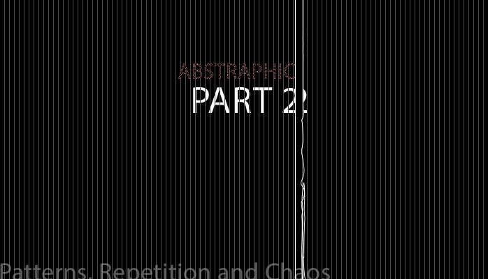
Part 2: Patterns, Repetition and Chaos
Patterns and chaos tend to co-exist in design.
A key area I think we all need help in – myself included – is recognizing patterns as they occur naturally. And like a bat uses its sonar to bounce off of cave walls, wraps around trees and engulfs their surroundings before reflecting their world back on them as they fly – learn to see shape and motion in new ways.
One of the first things you learn as an artist in drawing and painting is to hold a mirror up to your work. Looking at things in a reflection forces your brain and eye to interpret things in different ways. Elements you thought were in proportion are suddenly out of proportion. Lines you were positive – even after you redrew three times with your T-square – are no longer perpendicular. As we grow up we train our eyes to see what we want to see, not always what is there. Our eyes and brains start out seeing the world in a very different way. For the first week’s infants see only shapes and limited colours. Add that with a brain that is not yet developed enough to interpret the world yet. I remember spending hours staring back at my children in those first few months and wondering what they really saw. Was I just a shape? Did they focus on the edge of my ear and view me as nothing more than an abstract line floating next to an eye?
“Does he have super gross hands that look like they’re made out of big pink sausages, like eagle talons mixed with squid?” – Emmet from The Lego Movie
There are benefits to forcing your eyes to see things differently. Try to relax your vision until you are unfocused on anything, then see if you can ignore elements in the direction your looking at to look for connected shape. Learning how to recognize depth may help us walk without stubbing a toe or braking a heel, but if you could train your brain to look at collapsing depth into a single plane you can see very interesting shapes and intersection of like and angle.
Think about how you see things.
One of the best uses to this way of thinking and envisioning is not only to let you slip into a state of playful, creative bliss without any reason or rules as a child would – but to also allow us to see patterns and how those patterns repeat. With patterns you can take your inspirations for whatever you are designing and begin to take incremental steps to abstracting it visually not just conceptually. I love pattern. And I’m sure my obsessions with it make me look odd to some if you find me staring blankly out a pair of windows looking at how the bricks that were intended to be consistent naturally loose their organization as they get old or are patched.
I am one of those people who prefer to challenge the hell out of my viewer. I don’t like to dumb down, simplify or give easy access to interactivity all the time. If we do not challenge people how will we ever evolve their ability to understand technology as it shifts to an ever more complicated patter of interactivity? Though many would argue that your design of digital projects needs to appeal to the masses and feed the lowered common denominator I prefer to challenge people willing to make an effort. A passion that has led to a lot of back and forth in many commercial projects as the work is slowly cannibalized to appeal to selling more products and speaking to the consumer like they were children. That is of course all par for the course. When you can push the limit and try something different to make something more unique and challenging I implore you to try. Don’t let your vision be crushed and your works become expected. Start at level ten and let them push and prod you down to a level six. Some of my favourite design projects were so out there and abstracted it took forever to explain and justify their benefits. I don’t see that as a failure. I see it as a challenge to expectations.
Find new ways to visualize.
Chaos: a state of utter confusion or disorder; a total lack of organization or order.
I always appreciate the act of intentionally breaking it to find a bit of visual chaos. By definition chaos is the exact opposite of order and pattern. It refers to a state lacking predictable order. So it is hard to find design chaos in elements that are made by humans, as we tend to organize, compartmentalize and order everything. Take a bucket of paint and throw it at a pole, look at the splat not only on the pole but also on the ground behind the pole. Organic and chaotic, but is it really lacking order? After all it is still within the constraints of a human made system. Nature gives us some fantastic references to chaos at certain optical views, however eventually it will form order and pattern. Like us, nature loves organization. It makes sense when you think of everything being built from the code of DNA. At our essence organization is prevalent in everything. Yet within nature you do see natural chaos or changes to the system – like a sudden change of weather’s affect on a small coastal town or the shape of a tree that can be organic and seem chaotic, however a leaf is a often a repeated shape. Get down to the microscope level and the cells that make up said leave feel even more organized and patterned.
Order (in relation to space and time): The disposition of things following one after another, as in space or time;succession or sequence.
Because of this I have a hard time believing in graphic design chaos, only because I have a hard time believing humans or machines are capable of achieving something that is truly chaotic and unordered. Even things like random visual generators that pump out shapes and colours in a rhythmic pulse are built on mathematical equations that are a base of order. However the thought of changing patters randomly can still lead to interesting results.
I do believe in is the essence of chaos. That is a thing that looks and feels chaotic on the surface versus things that feel organized and patterned can lead to breakthrough in getting attention. This is where we learn to hide the rigid patterns and expected visual order with more organic and unexpected design choices – like a black image with white lines that are all spaced equally apart and move from edge to edge except that one line that stops an inch from the edge. Your eye and mind expect it to continue onward. Like cropping a photo at the edge of an eye to create a lovely pinch that can infuriate some designers and photographer but lead to an excellent tool to draw attention to the eye.
So maybe it is less about trying to force something that will inevitably have to fall into a sense of conformity in design but embracing the mishaps and changes in the patter as sparks of interest. But to do this it you need to open up your eyes and think not only of what you see…but how your brains and eyes interpret it.
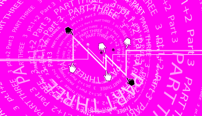
Part 3: Freedom through interaction
In a recent article on practical techniques for dealing with the world of grid based responsive design I talked specifically to the idea of our minds needing to break free of self imposed limitations. For the most part it was in relation to a design canvas. In this article – getting back to the idea of Abstract Design – I want to talk about giving up control. More theory, less pointers and in-practice cases here – so be forewarned.
Abstract thinking is at home with digital innovation
Design surrounds you all day long. Anything we make is designed at some level. Much of it mimics other concepts of those who came before us. In nature, design follows it’s own patterns and order – though there is more possibility of outside forces shaping the results. A blade of straw varies in length, width and surface. But weaved into a basket can create a very structured design. So in a world of inherent pattern it can be hard to find examples of abstraction and chaos that can still have enough form to give over to function. (It can’t all be simply for the sake of a “because it looks interesting” view point after all.)
Modern building designers can be masters at creating beauty in shape while still balancing a secure structure weighing tons. Physical design plays very interestingly in the real world and can be seen from many angles. It has to be very complex to be successful even when it may seem simple. When you walk up to a well-designed building you get a feeling from it. Your interaction leads to an emotional reaction as you move around and through it.
Interactive design can take the same cause and effect. It can create an artificial sense of ownership during that interaction – even if it is only for a limited time. (Refresh the site and it returns to how it was planned structured.) What if we start to allow the experience to be permanently evolved by people? I recently read an article claiming design trends would begin to take choice away from people to empower the designer. In my mind that is a dangerous step backwards and a kneejerk reaction to people feeling too precious over their design (ie: a service you are paid to do, not simply the personal experimentation you may due on your downtime). I find it similar to when photographers based stock before becoming stock providers themselves in the early 2000s. Personally, I would caution anyone who works commercially to be mindful of being overly protective and resistant to collaboration in a society that is continuing to become more and more entrenched in community solutions and crowd sourcing. It is an old way of thinking. “It’s mine, you can’t mess with it. I want it that way.”
When it comes to design – we could learn a lot from how programmers work with each other to solve problems.
Opening your mind may mean letting go of that control. Developers continue to move beyond simple functions in software and digital. Why does it matter? These people help sculpt the landscape and smart software-makers work with the new frontier breakers as they version upgrades. A decade ago we shared our tests and code – well most of us. Code is now protected and confidential to protect companies investment. This is necessary in some ways to ensure companies prosper for the time they put into development in such a competitive environment. Despite this much of the discussion to solve problems still happen online in forums and communities.
Designers could learn a lot form the open dialogue. Instead of simply seeking critique on your portfolio or answers on how to deal with some software bug – why do we not discuss ways to improve our thinking and collaboration? Why not discuss more with programmers on how to break new ground in design as well as code?
Interaction can allow for beautiful creative expressions.
I propose the interaction because I have always been a fan of creative and tech working together. There is no worse way to create mediocrity than to work as designers and talk to the developer when you’re done. Again, stop being so precious. This relationship can be a wonderful place to apply abstract design methodology. You are already in the cyber world where the exploration is more accepting. Think about that original example of abstracting the shape of a fruit back in Part one of the series. Doing so in a static design may give you an interesting end product but it is still static. But in this landscape you can start a design and let the world around you change it. The amount of control you allow is up to you.
The more control you give up the more abstract and unique the expression becomes. And typically the more interactive and empowering for someone who is touching your design experience. If you don’t need to have a friend who is a skilled developer you can create manually by handing over your files and seeing what you get back. Or upload your idea and assets to a community site with a challenge to make it awesome. Possibly add a rule that people can add but not remove if you like. It’s actually not that uncommon to art collaboration tactics that I’ve done in the past where you start a painting and mail it to another artist and so on.
Interaction and abstraction
Now start to put that same thinking on the actual interactions of a user. Look at how things are connected from section to section in an experience. Look at how intuitive users interact. Try hiding the navigation and find solutions on how the user can explore and learn on their own. Time and time again I hear the same arguments about simple website navigation and web standards. Anchor your nav to the top of the page, do the same thing the user has seen a hundred times. In some cases it works fine if your end goal is to follow along and make your experience mainstream and accessible to the lowest common denominator. It is also the best way to make an experience forgettable. Remember how AMAZING that government site was? Me neither.
There are no rules to how someone can or should explore a digital experience – it is a matter of how the creators want the user to behave.
The only reason we keep using traditional standards is because we are usually too afraid to try new things and test them to see how they work. Some of the most amazing websites out there challenge people. Think about that when you designed a digital experience and force yourself to step back. Ask yourself if you are starting it that way because it’s expected or because it’s right? This is a HUGE question we usually forget to ask.
Start to break it up more. Go until your design is lost and it becomes chaos. Now from that try to work your way back to your original intentions.
The end result may end up feeling fresher and breathe new life to the piece. It can very well be a work of art and still be functional. We let go so little in our trade
*****
About The Author
Todd Lawson has worked as a gallery artist, commercial artist and a creative leader in advertising, design, illustration, CGI, publishing industries and software product design. As well as a leader in the automotive marketing space. Since 2002, Todd has been fortunate to have done some great work, worked with some great people and been recognized globally for it. He works with companies at all levels of development to lead, mentor, ideate, grow teams, guide projects, face to face interaction with clients, partner with vendors, seek out new technology and trends, plan and execute. See artwork, marketing projects and more articles at ToddLawson.com.