But Google said so?!?!??
With the recent announcement from Google that sites with inaccessible mobile content will soon find themselves being effectively delisted in search – old mistakes are coming back to haunt us in the digital design. In truth it’s more like Google finally drew a line in the sand simply because we’ve spent years talking to ourselves about how to make sites for multiple platforms but for the most part doing it half-assed.
At Dashboard we are feeling much of the same things I would assume many digital savvy vendors are. Clients are calling confused about what they can do to their site – or calling with confidence that they are out of date and forced with the need to finally get on the future train. Fortunately we have a few systems already in place and moving to a product first model has already shifted a few clients to other vendors for another solution so we are not as scrambled as I know other firms are.
Dealing with our past.
Most sites built or updated in the last couple years are likely fine. Even if you end up having to optimize and link a few more pages to make your mobile experience better mirror your desktop one to keep your SEO ranking strong. However the vagueness of Google’s direction has left some in sudden panic mode asking: Are we ok? To be frank – we kind of did it to ourselves with our inability to convince clients to keep up with a medium that unlike film, audio and print has never stayed constant. We scope and bill clients in digital like its a print ad and it will never change. Rather than with interactions and retainer based models to keep them cutting edge.
The classic approach from a few years ago where you build a desktop site and a smartphone site and tell your code to display one or the other based on what device hit the web address is now coming back to haunt us. Mostly because we decided to keep our overhead lighter and do smaller mobile versions.
As we continue to work in a world where design is more reactive to the user than ever and we build more for the “what if” rather than the “here is the experience I’d like you to interact with” designers are in danger of turning a beautiful medium into a stale template. Yet we are beginning to see them use titles like UI designers. A term that elevates you above a paint by numbers design methodology.
As we all start to over use design terms like responsive and reactive to the point of nausea in our day-to-day conversations designers are in danger of beginning to box themselves in creatively. (Pun completely intended) Designers are working within responsive templates and grids based on industry standards set up to make other people’s lives easier. To help us categorize, standardize and ultimately control the medium into what we feel works best for the masses. But not always what will drive them into the future. It makes sense when we are simply unable to keep up with the latest screen ratio of the latest device and an ever-shifting percentage of market penetration that we would start to design smarter. Who really wants to create 10 versions of your home page for every device out there?
Help – I’m trapped in a box!
In that way yes I understand the need to build on logic not on templates. However for those of us who were designing, slicing and coding sites in 2000 or who remember the day Flash allowed you to play back video for the first time long before it died out – we are also in danger of loosing one of the best aspects of digital design. It can be the Wild West if you let it. Though of late the digital Wild West is happening more with tech innovation.
Too often I am seeing designers trapped creatively by their own desire to grid and box for the visitor’s device. Constantly thinking of all the ways their site will need to react but not asking themselves a few key questions that may feel personal but will ultimately lead to breakthrough design. The kinds of design expressions that make people feel challenged and excited.
Adding to that designers and coders often work in very intense work environments where every outside force from truncated timelines to inexperienced staff to uninformed clientele to fearful bosses unwilling to spend time on creative R&D. Is it any wonder we often forget the plot by the time we are building and perfecting?
HELP – I think I’m Trapped in the Grid
There are a few things you can do to start to break free of this way of thinking:
- What shapes fit in that box?
Just because it is a gridded format to make it respond better doesn’t mean all you put in that box is another square. Take a look at how a traditional painter or muralist breaks down their painting into a grid to help transfer it to a larger canvas. - Your canvas is structured on grids – not limited by them.
STOP believing that site background and content live separately of each other and stop creating vertical walls.
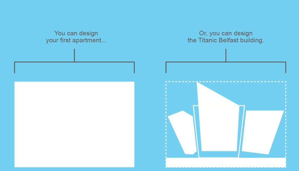
Do you like staring at a square building against a blue skyline? (Because that is what you are doing with your design). Instead look at letting that background breath and move into the safe zone. Start to treat your content more organically. Look at how modern architecture treats the edge of a building to create more unique negative space around it. The power of more unique image templates in your slices or transparent formats like PNGs are your friend. - Are you designing it that way because it is expected?
If the answer is yes – then you are wasting your time. It’s already been done that way. - Don’t be afraid to say why you think it’s right.
Too many times I’ve witnessed great designs fail not because others disagreed or forced you to their vision – but WORSE because they didn’t even try to explain or fight for it. The most successful people in any industry are not blades of grass in the wind. They are also not immovable. Find a balance to maintain what the design could be. - Design for the 5% – not the common user.
In no other medium is it more important – other than possibly tech innovation – that digital designers work as champions of progression not limiters. I expect people to be able to use my designs. However I also expect them to work a bit for them so they can feel good about learning new habits and improving their ability to interact with technology.That is called innovation – rather than repetition. Take a look at Apples recent announcement that their MacBooks will be going to single ports. A move that forces an industry and a consumer to rethink how they work with the products to keep up. I am a firm believer that the best innovations evolve in leaps and bounds – not in baby steps. So why would design language innovation on a medium that is also evolving not be the same?
Eat it grid.