PART 1 OF MY UX FOUNDATION SERIES
Over the course of over two decades creating interactive experiences and balancing creative thinking I have spent a lot of time on understanding how things interact with people. In the early days of website design we ignored a lot of the disciplines software developers used in exchange for quick wins and fast track creations. Much of that was tied to marketing and company branding who didn’t want to wait to get their experience up and admittedly didn’t see the value of investing deeper in user understanding. It was the divide that lead to standard website design to sites like Google and Amazon becoming so much deeper experiences vs brochure websites and one-off-campaign-driven experiences built to only last a short while. And why do apps on your phone and social networks that still thrive today work more like product companies than web design companies?
It is often the difference between one web design shop charging $50k for a build versus $200k – the planning takes some serious investment in labour to do well.
For many who have not been exposed to working on the software side of interactivity or app development or within a SaaS firm who treat software as their service and core – you likely only know parts of the deeper UX thinking that we all wish we could instil in smaller projects. Having worn both hats I wanted to give some foundation to those looking to deepen their UX understanding.
Planning & Discovery
The Consumer Or User as your centre of all things is what drives UX. Stakeholders, internal staff, clients, developers, designers all have solid ideas and opinions and can back those with their own data – but ultimately the user is the top of the pyramid. There are a lot of ways to start to understand that user.
From traditional interpersonal fact-finding like interview sessions, recorded interactions, in-experience feedback loops (like submitting a suggestion or bug investigation), surveys, group sessions, and 1 on 1 sessions to name a few. What these do well is give you a POV of one or a few. But what they also do is skew the feature lists or suggested changes to a UX without validation toward mass adoption.
If you’ve only ever built experiences for brands or clients say in a design or marketing firm you are likely fighting an uphill battle as the ultimate decision comes down to the opinion and wishes of a single person or small group (the clients) who is paying for the service. Software – if they are doing their job right – instead looks at all the suggestions from traditional user information along with tracked habits from data; analytics, heat maps, ranking, and grouping of similar requests and habits. Then marry the two sides by giving the list of the most valuable features or changes that will make a certain percentage of the overall user pool happier and more likely to keep using the experience. This makes sense as advertising or paid subscription to the software or site is what drives their growth as a business. This percentage is then further balanced against the cost of investment (time and resources) to make the feature. Giving them the ultimate answer to the question; “Is this worth it?”
Getting to the short list of what the users need is not always what they want. It is the team creating the job of the solution to discuss, investigate, and determine what the best answer is. The first step to unwrapping that data is Journey Mapping.
Journey Mapping
A fantastic precursor to mapping techniques was written by the NNGroup a few years ago: https://www.nngroup.com/articles/ux-mapping-cheat-sheet/
They break down 4 key types of Consumer Mapping:
- Empathy mapping
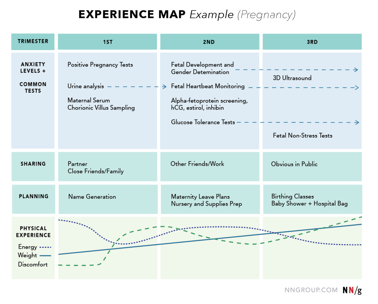
- Customer Journeys
- Experience Mapping
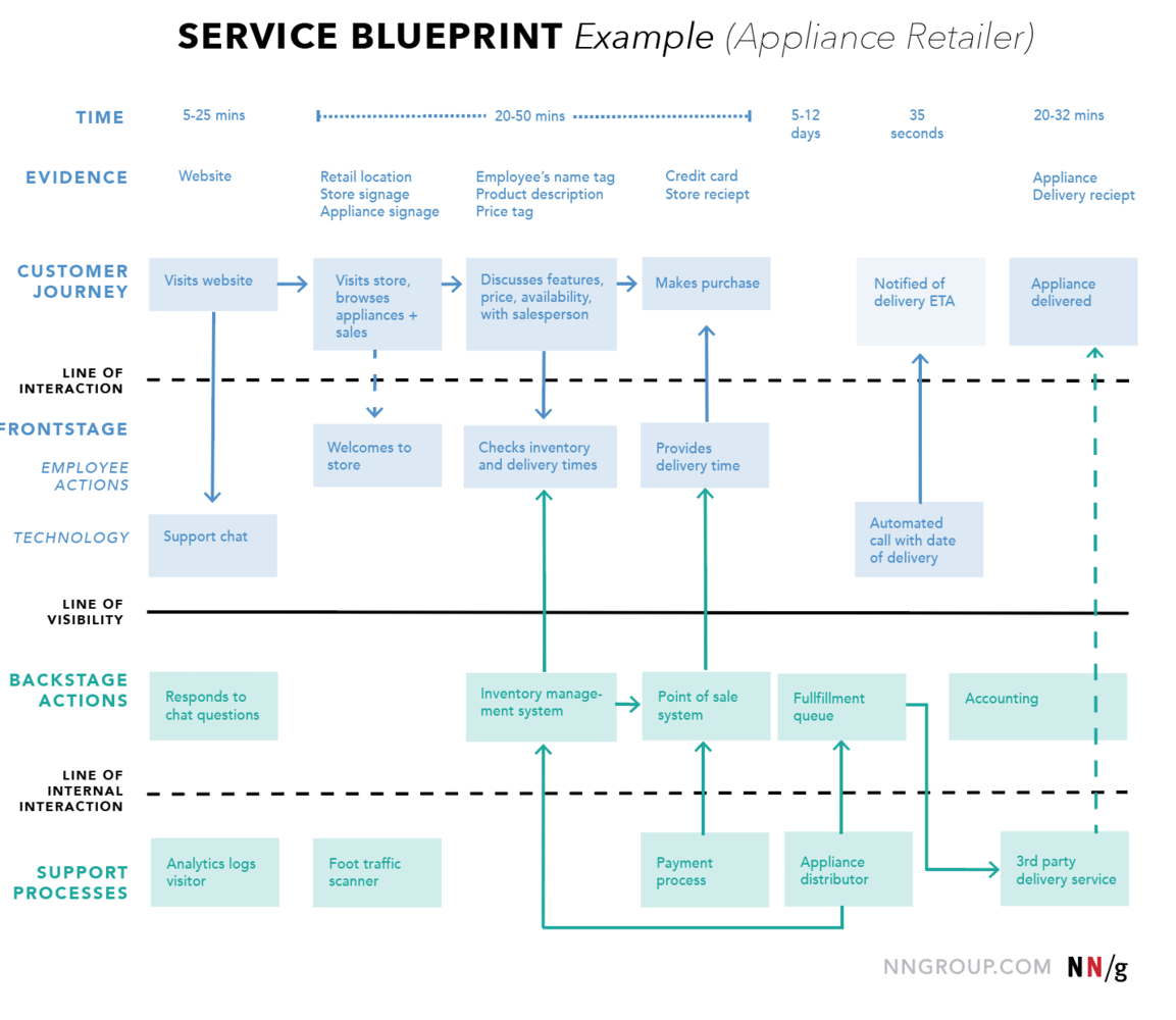
- Service BluePrinting
If you are coming from marketing you may have a viewpoint on what a consumer journey is and the first two items on that list are likely familiar to you. However, its when you start to add on top of these tools with experience mapping and eventually with Information Architecture mapping that you start to have a deeper understanding of how something will work and who will be using it.
Information foraging offers a unique alternate – albeit now pretty old metaphorical parallel for how to think about users. It compares the user to how animals forage for food with scent, sight, and potential to stay or return. It is often used to determine the value of site information and content.
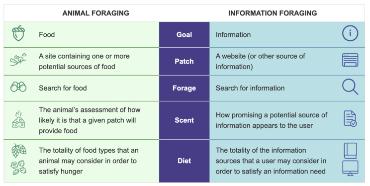
It is less of a mapping tool and more of a way to theorize habits you may see come out of data and journey mapping. And let’s face it, comparing users to animal instincts is kinda fun…
Taking this information is then what leads you into Information Architecture mapping. This is also what will finally give you a real estimate of how much time it will take to code or design the feature or experience.
Information Architecture (IA)
The biggest confusion I see with designers who have spent time only in agency or only on websites is the concept that a Site Map or navigation is the same as Information Architecture (IA). If the site map was the doors and windows of your home (access points INTO the house). IA would be the network of electric wires, plumbing, and HVAC in that house that makes it work. While content maps and content hierarchy maps would be the home’s floor plan with UI being the furniture, colors, drapes, brick, etc (all the stuff you see on the surface that makes you think “Oh this is nice, I want to explore each room.”).
But what would happen if you tried to use this fancy home’s bathroom and the shower had no plumbing or drain? That is the crucial importance of IA – to solve all the unseen UX that developers can code the experience to work smoothly so the user is always happy and encouraged to keep interacting.
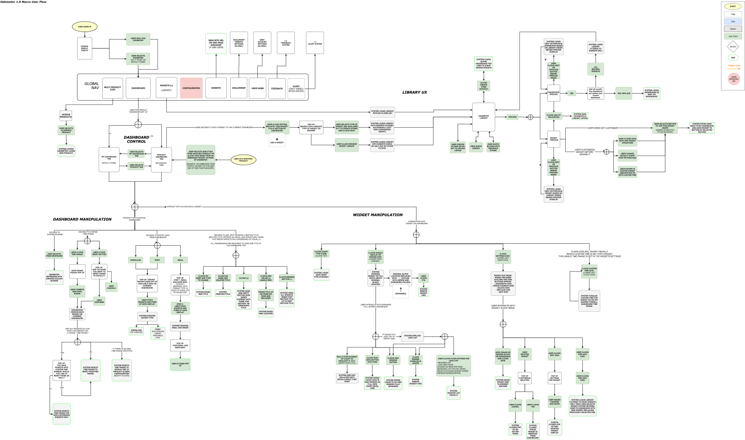
I’ve always broken my IA flows into a few different categories:
- Macro – overall system
- Micro – individual features, functions, or cases
- Data – how and where data flows including 3rd party integrations
- User – how the user will most likely engage with a system
There are many more. But That is where I tend to go. I then break each IA micro map with written details for documentation and eventually, you layer on wireframes and UI design – creating a full package for a developer to execute.
These first two UX steps: Discovery & IA Mapping are my favorite areas to work in. I don’t mind wireframing or designing UI, but my heart is in UX more than only UI so I often work with designers to take on the pixels after a point. Though I’ve done points A to Z as it is important to understand it all.
A core balance to how to read AI flows with journey maps and data is to think about what is findable and what is meant to be discovered then what needs to happen behind the scenes to make that experience seamless. Your audience will access the experience from somewhere with a predisposed expectation – even if they know very little. They searched and found you or downloaded your app or are using your software with intent and at least a small amount of expectation. Some information they expect and will actively want to look at and find it. Less expected, additional, or unknown areas they find are discoverable and can be either opportunity to improve an interface (if it is required information for your audience) or to remove if it isn’t being accessed and no one discovers it. Sometimes these discoverable information or experiences become that special extra sauce that makes it memorable, sometimes they are the area we mistakenly spend way too much time and money on creating in error.
Applying this level of UX planning and research to projects
The hardest thing to do is convince someone who hasn’t seen the value of this level of time investment to take on these early steps. Especially in a world where time/money often means getting it done in a few weeks. There is often simply not enough time. It can fail in grand fashion if the people doing these early steps are not able to present technology and UX in a way that the audience can understand if they are not tech oriented as well.
But imagine if you even started to take a few extra days to scratch the surface of the level software UX teams do with your digital experiences.
***********
About the Author:
Todd Lawson is a creative/art director who has made commercials, brands, software, and ad campaigns, who understands tech and designs UI & UX, a designer who does large-scale paintings, a painter who writes articles, a writer who is constantly curious about what’s next. His curiosity has garnered Cannes Lions, One Show Pencils, CA’s, Cassies, and countless other accolades. In 2014 & 2015, he was Ranked 9th & 15th Best Art Director by Strategy Magazine’s Creative Report Card. As Digital User Experience Lead & Associate Creative Director, Todd helped Grey Canada win ADCC’s 2013 Agency Of The Year. But the story doesn’t stop there. In 2015 Todd left Grey to Co-lead the complete transformation of Dashboard, his past agency, from a 16-year-old marketing firm into a Software SaaS Development Company, successfully selling it to tech firm Vicimus in under 2 years. Todd then led the company rebrand, developed departmental processes, guided UI/UX for products, oversaw and built external marketing plans, and rebuilt creative and design teams.
See 20+ years of curiosity at www.toddlawsoncreative.com
Vertical Experience: Automotive, AutoTech, Alcohol, B2B/B2C, CPG, Cosmetics, DTC, Entertainment, fashion, Financial, Food, Gaming, Health & Wellness, Insurance, Marine, Not-for-profit, Pharma, Publishing, Software, Retail, Tech, Trade events.
Gallery Artist since 2004. Commercial artist/illustrator since 2001. See artwork at www.toddlawson.com