ORIGINALLY PUBLISHED ON LINKEDIN.
How many steps does your design process have?
How overly complicated and layered is the loop from start to launch to repeat?
I bet many of you share all your steps in pretty infographics and overly large typography on your sites and in your pitch decks to show your clients and prospects how hard you work. How much you are worth…how much they will be involved…how much you safe check and control every penny and step for them.
I also wonder how many of you are drowning in your own need to police these rigid rules to get the job done and hide the WIP steps from clients – when you should involve them more.
We preach things like minimal clicks, streamlining touch points to purchase, simplifying strategy… to brief… to idea… to tactic…yet we continue to give ourselves these detailed layered processes. Design and creative development is overfilled with them. It’s why one agency may take weeks to produce what one or two contractors can. It’s why software developers preach 2 week scrums and sprints yet take months or years to produce a feature or new product. It’s why we are always faster when there is a deadlines presses on us or pitching a business than after we win it. A few weeks to think…a few weeks to design…a few more weeks to think and talk about what we thought and what we designed…(Ugh!) then maybe we’ll start to write a line of code. No wonder companies dry up without shipping product or agencies get fired for not delivering. We practice precaution where we should practice being more prolific in our output at an earlier stage. We focus on laser vision where we should shot gun ideas and verticals. We over practice staged pitches and pre-canned brainstorm sessions with clients hoping they won’t derail it when they will and they should.
It’s like being on a first date all the time, afraid they will leave you if they find out who your really are…
With that in mind I wanted to discuss a process that we have used on and off here at Vicimus that I have enjoyed and found works better – for the past year. The Fast-to-prototype UX processes (which can also be applied to other creative practices).
What is it?
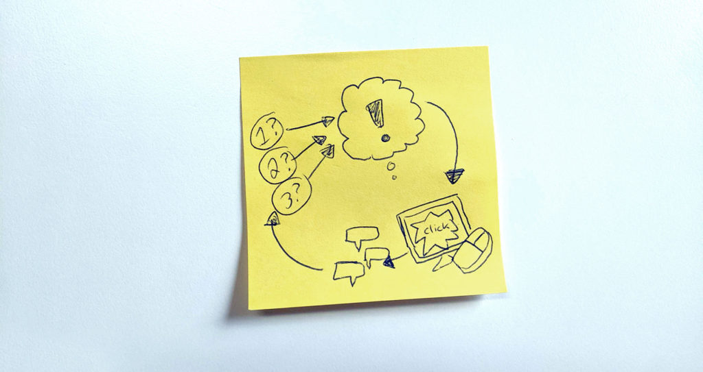
Simple. It is about getting an idea for anything that is interactive from an ask to a basic, simple, focused prototype in 2 weeks.
How does it work?
As we say in advertising: if it’s more than a page it’s not a “brief”. The same goes for product development. If you can’t describe what it needs to do in a list of 3 then it’s too complicated and you need to break it down into more parts. Once you do focus on breaking it down – list out the 3 problems the product needs to solve.
Then for each problem ask:
- Who is faced with this problem? (ie: who is your 1 primary user)
- What common obstacles do they face today in overcoming this problem?
- Why they should care enough to solve them? (this instills empathy into what we do and ensures UX is focused on human need and emotion, not just simplifying design for our own selfish wish to make it look nice)
This is the research phase before the work starts. Give that list to your UX team or designer or creatives to problem solve with a firm deadline to see a working basic prototype in 1-2 weeks. If you think that’s not reasonable you made the problems too complex and have little faith in your team.
From there get them into a basic linear click through prototype as soon as possible. I’m talking in that 1-2 week deadline. Seriously. This isn’t a designed, polished, “oh look at my design skills” interface. This is a basic grey box (or any other basic colour) interactive model to show the core elements in action. If the buttons or actions on each screen don’t serve a purpose for the 3 problems don’t include them. You will have infinite time to throw those in later and busy up your designs but you may find you don’t need to if you wait to solve those in the next round.
What is the goal?
Your goal is to get it to a basic controlled prototype you can share back with a broader team, whether that is developers, designers, researchers, department heads, clients or all of the above in a quick review. Make sure whoever is the decision maker for the project is in the review. Take the feedback and implement it directly into the prototype for another round within 2 days and show again. That is why you keep it basic. So you are focused on the core use and not the details of aesthetic.
For the next step skin/design over the prototype in the same 2-week sprint and repeat or continue in grey box mode until it answers all requirements of the larger project’s objectives.
Why does it work?
You are not stuck in 4 weeks of designing elements or drawing wireframes with marker…or god forbid cutting out paper and string and flexing your crafting skills. Or over using post it notes to look busy but produce little. You are focused on getting to something that you can ‘Play’ with and others can understand before you waist any time on over complicating the ask. It makes each step easier to make decisions on and the discussions more focused. It also gets you to a “pretty” prototype faster and brings everyone along for the ride from the start.
Ever wonder why you shared a bunch of pretty designs and it was shot down or you were told it was too complicated? Or why your bosses or clients are suddenly micro managing you? It’s because the audience wasn’t there in your head for the weeks you spent toiling away and has no context or invested time(ie: money). That’s not their failing it is your process failing.
We talk about 2-week sprints with small asks and in programming all the time. We talk about being Agile. However we often are so focused on how to slice and dice features, tasks and problems that we worry less on how to make them digestible and inclusive in their creation and how to involve and rally a team or company around the process. Which in turn allows them to understand the details of the project or product better for their own particular jobs.
And it is more than just for UX and interactive…
Plus, if you are on the marketing side this can be applied to brainstorming and creating ideas quicker. (Along with 90 minute boot camps… another topic for another time). You know we used to present ideas as marker drawings on paper with some mood board examples and it worked out just fine. If your client knows what they will be seeing and is involved earlier on you will have a much easier time selling it back to them. Because they already bought into it.
Feel like your processes and rules are getting in the way or worse, ignored? Try to simply not just the requirements but the output into quicker timelines. “Work smart not hard” as they say.
What tricks or streamlined processes do you follow or fail at? I’d love to know.
#keepdoing
ORIGINALLY PUBLISHED ON LINKEDIN.
***********
About the Author:
Todd Lawson is a creative/art director who understands code & designs UI & UX, a designer who does large scale paintings, a painter who writes articles, a writer who designs clothing, a clothier who is constantly curious about what’s next. His curiosity has garnered Cannes Lions, One Show Pencils, CA’s, Cassies, and countless other accolades. In 2014 & 2015, he was Ranked 9th & 15th Best Art Director by Strategy Magazine’s Creative Report Card. As Digital User Experience Lead & Associate Creative Director, Todd helped Grey Canada win ADCC’s 2013 Agency Of The Year. But the story doesn’t stop there. In 2015 Todd left Grey to Co-lead the complete transformation of Dashboard, his past agency, from a 16-year-old marketing firm into a Software SaaS Development Company, successfully selling it to tech firm Vicimus in under 2 years. Todd then led the company rebrand, developed departmental processes, guided UI/UX for product, oversaw and built external marketing plans and rebuilt creative and design teams. See 18+ years of curiosity at www.toddlawson.com